I Made An Art Journal!

Over the past few weeks I’ve been working hard to declutter my bedroom. Since leaving college I have been gathering piles of random paper and doodles that probably should have gone in the bin. I managed to bin most of the paperwork but I was amazed at how many random drawings I found. Instead of throwing them away decided to create an art journal, and make collages with them.

I’ve always flirted with the idea of art journaling. I kept a written diary for many years and found it therapeutic. I find art incredibly calming. When I’m feeling anxious or upset I often turn to drawing as a way to take my mind off it.To boost my inspiration, I joined Journal Workshops, an online art community created by JennieBellie. I don’t know if I’ll ever use my journal like she uses hers. She puts so much hard work and effort into them. Mine is a lot more scribbly and rough. That being said, I’ve really enjoyed working in this journal. I just know art journaling is going to be one of my favourite pass times from now on.

I made my journal out of a Morplan catalogue I had in the post that day. The pages were really thin so I grabbed random bits of paper out of the piles I was throwing away. It’s mostly college stuff, one of the backgrounds is actually my 2015 ucas application to study history. That page can be dedicated to my inability to make life decisions. The illustrations on that page where the first ever fashion illustrations that I did. It’s encouraging to see how bad I was at drawing last summer because it makes me wonder how good I’ll be next summer. I’m sure that I did the portrait of the girl with pink hair when I was around 14 so I was happy that I found that.

LOUISE ALICE JAY ART JOURNAL Catalougeg I have a HUGE Morplan catalouge I’m keeping for when I finish this art journal. It has around 600 pages and would probably take about 4 years to finish. I want to have a big journal so that I can flick through it and see how much my skills have improved over time. I have some old university prospectuses that would make great journals too as they have thicker paper. A coat of gesso and they could probably be painted on.

As I work through my journal I’m going to start sharing recent pages here on my blog. I’m also going to be taking part in the monthly challenges on Journal Workshops. I like the idea of doing a monthly blog post reviewing pages in my journal, and sharing what I did during the channel.

Does anybody else keep an art journal? do you prefer to use sketchbooks, altered books or do you prefer to make your own journals?


Advertisement

7 Ways To Save Money On Art Supplies (For absolute beginners)


Blog Image and pinterest 7 ways to save art supplies beginners

Art is a super rewarding hobby if you like being creative. With some simple supplies and paper,  you can create new worlds and characters on a blank white page. As a beginner myself, I know how intimidating it is to look at YouTube tutorials and see them using art supplies that collectively cost hundreds if not thousands of pounds. Over the years, I’ve become pretty savvy at saving money while buying art supplies. Even when I do splurge on things like Copic markers, I always make sure to get the best deal. Here are 7 tips for making your money go a bit further when it comes to buying your art supplies.

1. Buy kids art supplies instead of adults.

Brands like Crayola and Berol produce AMAZINGLY pigmented markers and pencils that will be just fine for any beginner. Crayola have a huge colour selection across all of their products and the quality is fantastic for the price.

2. Buy art supplies from pound shops.

This can be hit and miss, but I have found some amazing art supplies for such low prices in pound shops. If you are out shopping and have a pound to spare pick something up and experiment with it. Cheap felt tips make great watercolour pens. Cheap watercolours can be great for adding a quick wash of colour to illustrations where the painting doesn’t matter. Keep an open mind and be open to experimentation.

3. For wet media all you need is 5 colours, Just make sure they are the right ones.

For things like ink and paint you only need to buy 5 colours and from these you can mix any colour you want. Finding mixing difficult? it’s probably because you’ve been taught to use the wrong colours. Using Red, Blue and yellow will get you okay results when mixing colours but the outcome will often me really dark and muddy looking. Even though these ARE the primary colours, they aren’t really the best colours to use when mixing pigments. You will get better results if you use the same colours as the ink in your printer. Buy a really bright magenta, a bright yellow and a Cyan blue and you will be able to mix any bright colour your heart desires. Throw in Black and White and you can create any shade of any colour your heart desires.

4. When purchasing art markers, get refillable ones. When you get more serious about art you may start to covet expensive art markers like Copics and pro markers. There are so many options for art markers out there and they are all expensive! Which one should you choose? If you are serious about using them, I recommend any marker that you can refill. I absolutely loved my Copic markers when I got them, and after 1 college project where I used them regularly my skin tones and my greys had completely run out. This was after just 3 months of use. If it were not for the fact that they were refillable, I would have had to replace those 10 markers separately and it would have cost almost as much as a paid for the 72 pack I bought originally. The refill bottles cost just a little more than 1 single marker but they refill the pen around 15 times. This means that I spent more than if I replaced the pens, but in the long run,  I have saved myself hundreds of pounds.

When you get more serious about art you may start to covet expensive art markers like Copics and pro markers. There are so many options for art markers out there and they are all expensive! Which one should you choose? If you are serious about using them, I recommend any marker that you can refill. I absolutely loved my Copic markers when I got them, and after 1 college project where I used them regularly my skin tones and my greys had completely run out. This was after just 3 months of use. If it were not for the fact that they were refillable, I would have had to replace those 10 markers separately and it would have cost almost as much as a paid for the 72 pack I bought originally. The refill bottles cost just a little more than 1 single marker but they refill the pen around 15 times. This means that I spent more than if I replaced the pens, but in the long run,  I have saved myself hundreds of pounds.

5. Don’t buy artist quality materials if you are a beginner.

Despite what I said in the last point, if you are a new to art please don’t go out and buy a 72 pack of Copic markers. I did as a beginner but I was doing a fashion course and knew that I would end up using them a lot anyway. In hindsight, I wish that I had bought a set of cheap inks instead. You don’t need the most expensive paints, pencils, pens, pastels or whatever to practice your art. The work you create over the next year is going to be so much weaker than the art you’ll produce in 5 years time. The best art materials in the world aren’t going to make much difference if you can’t draw yet. You may have to work a bit harder with cheap art supplies, but just remember that when you do finally upgrade your work will get instantly better without you even doing anything.

6. Buy products you love in bulk.

Once you are very familiar with a medium and you find yourself running out often consider buying it in bulk. Primary school supply stores often sell  heavily discounted art supplies in class packs. If you love using things like crayons and felt tip pens then it may be better to buy them in packs of 50 or 100 than in packs of 10. It all depends on how many you go through. Wet mediums can also be bought in bulk. If you love acrylic painting buy 500ml bottles of paint instead of those little tubes. I’ve also seen 1-litre bottles of drawing ink. Have a look online and see what you can find.

7. Don’t buy any more art supplies until you have used what you currently have to its full potential.

If you are a complete art novice, and you have no art supplies whatsoever, feel free to ignore this point. However, I’m willing to bet that the majority of people reading this already have a bunch of neglected art supplies lying around their house. Before buying new things, have a look online and find some new techniques to try with the art supplies you already have. You never know what you will discover. If you want to save money, I highly recommend you try to master all of the mediums you already own before you go out and buy other ones.

Do you do any of these things yourself? If you have any other tips for saving money on art supplies please share them in the comments below! Thank you for reading!

Blingee Fashion Illustrations?

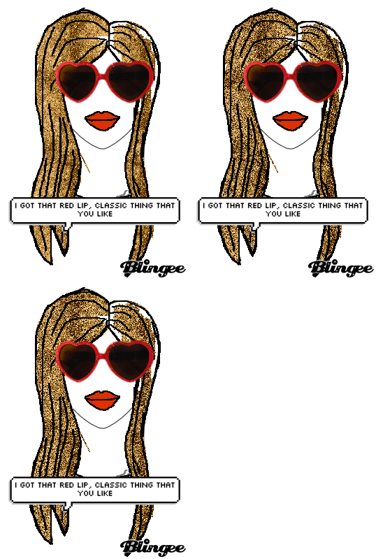
A few days ago I was looking for online photo editors I could use to edit pictures for free. One of the sites I was looking at recommended Blingee? photo editing on Blingee? I found it so funny. I hadn’t been on Blingee since I was 11 and couldn’t believe it still existed. I went to have a look, and it looks exactly the same as it did 8 years ago. I couldn’t resist trying to make something.

Louise Alice Jay Blingee 2

This was my first effort. No it isn’t supposed to be Taylor Swift.Colouring this took way too long. I don’t even know why I decided to colour the lips in on blingee because I could have done it in draw plus (I’m not good at planning ahead). A quick warning, Blingee is hard to use. What annoyed me so much is that you can get your colouring perfectly within the lines, draw over the top with thick black smooth lines and then blingee will MAKE it look like crap. It didn’t look like that before I clicked save I promise. I  desperately  wanted to find a sassy quote or stamp to add. I clicked on loads of those speech bubble things even though I couldn’t read them because I thought they might be funny. They turned out to be Taylor Swift lyrics, which is even better. Even though it looks awful, I really like it. A flashy Blingee gif is supposed to look shit.

Louise Alice Jay Blingee 1

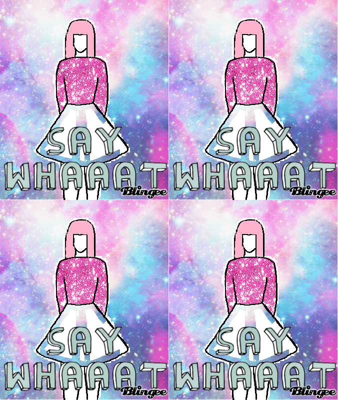
This was my second one. I was so angry. That galaxy stuff was only on the skirt when I saved it. But then on the finished image, the galaxy was everywhere BUT the skirt. It still looks cool though. It turned out better than the last one. Overall I’d say that this experiment was a success but it wasn’t worth the 2 hours that it took making them. I feel like a smart person could have made exactly the same thing 100x better in Photoshop. That being said, if I had some free time and some simple line art to colour I’d probably do this again. I also feel super confident drawing with my mouse after a few hours of doing this. I wonder if you could use a graphics tablet?

Have any of you guys ever recently used Blingee again as an adult? If you haven’t I highly recommend you do so. Grab your favourite picture of you with a friend / boyfriend/ girlfriend/ dog and make one. Send it to them on Facebook. I guarantee that they will love it.


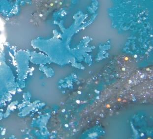
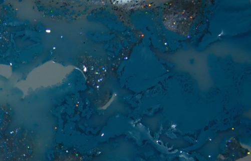
This is what happens when you mix PVA Glue, Acrylic Paint & Glitter

What do acrylic paint, PVA Glue & Glitter all have in common? They are all made from plastic! For our next and final unit in college, we are going to make a neckwear piece entirely out of plastic and it has to look beautiful. It can’t look like it’s been made out of  discarded plastic materials so I am trying to come up with ways to use plastics in a creative way.

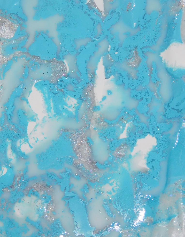
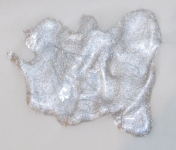
I have been experimenting with creating chunks of plastic out of dried paint & PVA glue but I think that the final pieces are going to take days to dry.  I wanted to take some photographs to include in my sketchbook if the experiment work. the photographs turned out 100x better than I ever could have imagined, and I’m no photographer!.

LOUISE ALICE JAY PVA GLITTER PAINT 3

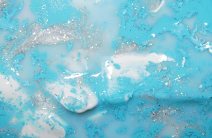
I was amazed at how beautiful it looks. I love how the PVA glue has caused the paint the separate and the glitter has stuck together to make swirls in the liquid. I am so glad I decided to take these photographs. It just doesn’t look as good in real life.

LOUISE ALICE JAY GLITTER PAINT PVA GLUE 2                                                  LOUISE ALICE JAY PVA GLITTER PAINT GLARE

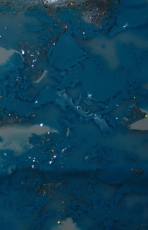
I am actually really glad I don’t know anything about photography. I was just selecting random settings on my camera and shooting pictures when I couldn’t even see the screen properly. Some of the pictures turned out extremely light and some pictures came out dark and grungy. I love how the dark images look, it really brings out the glitter. I wish these images were all the same size but I have absolutely no idea what I’m doing.

LOUISE ALICE JAY GLITTER PAINT DARK                               LOUISE ALICE JAY PVA GLITTER PAINT DARK 1

LOUISE ALICE JAY PVA GLITTER PAINT STRIPE 3              LOUISE ALICE JAY PVA GLITTER PAINT DARK 2                  LOUISE ALICE JAY PVA GLITTER PAINT DARK 3

I  don’t think that these samples are going to turn out right. They seem very thin and the consistency of the paint and glue are just too different, they don’t seem to have mixed well. I don’t think I would mind if it didnt work out as I still got a great result out of them, just in a different way. Also, I apologise for this blog post being a complete and total mess. I am still learning how to do this whole blog thing.

LOUISE ALICE JAY PVA GLITTER PAINT STRIPE 2                                                 Louise Alice Jay Glitter Paint


More Adventures In Digital Art

Last week I was feeling a bit down in the dumps and decided to treat myself to a professional printer with a high resolution scanner. I bought it so that I could scan my artwork and put it online. Because I spent so much I’ve been experimenting with ways to use it to my advantage when creating illustrations for my course. I used illustrations I had already done, and used Serif Draw Plus (free) and an Ipad app called Drawing Pad (around £3) to create these images and I’m super excited about how they turned out.

This was my first experiment, using an Illustration I did of Taylor Swift at the Grammy’s  in 2015. I scanned and opened it in serif draw plus and traced around it using the pen tool to create a vector line art. I then put the line art onto my Ipad and coloured it in using the Drawing Pad app. This took me about an hour altogether which is great for a first attempt (the second one was a lot quicker). Colouring it in on the app wasn’t easy because you can’t use layers like you can on more serious digital art software. You are also colouring with your finger;not the most accurate drawing tool.  With all that it mind I think it produced some great results for an app designed for children. For the colouring I used the chalk tool, this tool is great because light and dark strokes can be layered over eachother smoothly to create shading. I also swiped some diagonal lines through the skirt to make it look more interesting. The roses on the skirt and the bodice are just a brush I dabbed all over the bodice.

This is an illustration I did weeks ago during one of my first Illustration sessions. I really liked the simple shape of the design so I decided to recreate this one digitally too. I used the same process but it took me a lot less time because I found a way to use the drawing pad app more effectively. It doesn’t work as well as layering on professional software but I found a way to edit some parts of the drawing without touching others. I tried to work on one part of the design at a time, and each time I finished a section, I saved my work and opened the newly saved image in the app as a background. This meant that I could tidy up one part of the illustration without messing up all of the parts around it. This saved me a lot of time because I didn’t have to meticulously stay inside the lines.

I’m so pleased with how both of these illustrations turned out and I’m excited to see what else I can do with my new scanner & software. This seems like a really easy way to get the most out of my illustrations, because I can create loads of different effects on the same drawing. This technique could also help me when I am designing clothes, I could easily switch up colours and ideas without ruining the original illustration, or spending ages tracing the designs out in pencil.

First Attempt at Photoshop Colouring

dressdress copy

Here is a colouring exercise that I did in my CAD class in college. I was reluctant to try it but it actually turned out quite well. Photoshop is so expensive that I don’t think I would ever be able to afford it but it’s great that I can use it in college. I’m going to try and use it more while I can for free. I didn’t do the illustration above it was given to me so I would love to try it with my own illustrations. It was a lot faster and easier than colouring with markers. I’m really impressed it turned out so well.